Across the more dominant trends in home décor over the last few years, we’ve seen a lot of neutral, natural, and sleekness to brighten and open up a space. You can look to the minimalistic, hard lines of the Scandinavian sensibilities, the ever-popular gloss that seems to be depicted for every luxury pad, or even the more audacious natural leanings, such as with urban jungle rooms, where neutral and natural colors dominate.
You’ll see white, gray, beige, other earth tones, and a splash of greenery from plants as the dominant forces in these home décor trends. Here, we’re looking at what can best be described as the opposite of all that, in terms of color and impact. Warming and natural goes out the window with this one as we’re aiming to add some boom, some passion, and even a dose of good luck by basing a room around the color red!
Above all else, red is an eye-catching and impactful color for a great many reasons – which we’ll delve into shortly – so it’s not a surprise that celebrities are happy to deck themselves in the color and even embrace it in their lavish homes. As for home design, a lot of celebrities do follow the trends with the warming natural colors or going for cooler, and cuter aesthetics like blue-grey.
Robert Downey Jr. decided to pick a red hue for his living room. Picking Real Red, the Iron Man actor – a character whose color scheme is an iconic red and gold – he said in a feature piece with Architectural Digest that it adds drama and excitement to the space, helping to invigorate it and make it lively. Cara Delevingne offered a similar reason for picking a deep red color palette for her “bachelor pad” bedroom.
In the films that make celebrities celebrities, red is often a go-to color for beauty and making an impact. There’s the aforementioned Iron Man suit that never fails to announce the arrival of the superhero. You could also look to the smoldering temptress red dress worn by Nicole Kidman in Moulin Rouge, Julia Roberts’ red dress in Pretty Woman, and the distracting Fiona Johnson in The Matrix.
Beyond the world of film and celebrity, other forms of entertainment have happily drawn on the perception of red to add to the experience. In many parts of the world, red is perceived as a reflection of love, importance, passion, the auspicious, and many celebrate it as a giver of luck and prosperity through its life-generating energy. It’s this perception that films use when selecting costumes and how entertainment venues like casinos decide to construct their luck-based games.
Tapping into the perception of luck angle, red has become a go-to color in gaming establishments like casinos, particularly on the plush felt of the classic casino table games that are entirely luck-based. This is the case in the likes of roulette and especially baccarat, and into the hit spinoff and live games like Dragon Roulette, Double Dragon Roulette, and even Dice Duel. Red tables, red felt, and the color red on the cards and pockets all play into this affinity of red producing good luck.
The draw is so strong that land-based and online casinos lean into the red color scheme – only enhancing its association with luck. This is why the Baccarat game not only places in the top three of the All Live Dealer section at the classic table games site, but its game icon is predominantly red around the hostess. Combining red with gold in these casino games and beyond is a natural choice to emphasize this angle of offering good luck to the players. Wherever you see red in entertainment, the reason is that the colour is very strong to us.
Making Use of Red for Your Décor Ideas]
At one end of the color scale, especially when looking at recent home décor trends, you have the cool, calming, natural, and peaceful tones of light blue and natural green. At the other, there’s red. One of the strongest colors for provoking emotion, generally speaking, it runs from one end of the extreme with passion, desire, and love to the other with power, dominance, and anger. This is good to keep in mind when weighing up where you want some red and just how much you want.
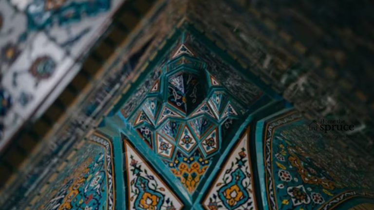
When people think of applying red, they shy away, depicting either a bright red or a particularly deep red and not seeing how it fits. Looking back over the use of red in art from Asia over the centuries, though, it’s clear that all of the positive emotions that the color evokes can be tapped into across its many shades. There was a recent trend where people would just add “a pop” of red with an accent piece to make the overall look be more cohesive though the “unexpected red theory.”
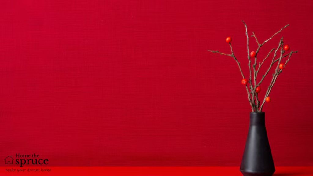
However, if you’re a true lover of color and really want to emphasize this sense of passion, importance, action, and good fortune, start with the walls and build in. It’s the boldest play to make – fitting of the boldest color on the palette. Now, you don’t have to go with that middle-of-the-wheel bright red. See if you’d prefer to lean a bit darker, such as with a cherry red, or perhaps more refined with a darker, more wine-like red.
With red encircling the room, you can play with your whites, oranges, yellows, blacks, and even greens and blues for the rest of your pieces and furniture, making for a truly unique and eye-catching space. Be bold and ambitious, and show that by leaning into the mighty color red!
Admin Recommendation
Mistakes to Avoid When Repairing Your Home